What makes a great layout for a website or online store?
An effective layout is accessible, easy to navigate, and intuitive. It is organised logically and seamlessly. It is visually appealing and immediately captivates the eye of the visitor.
An elegantly designed, user-friendly layout makes getting around as simple and straight-forward as possible for the visitor. Working out where things are or how they work shouldn’t require any amount of head-scratching or eye-straining – it shouldn’t really involve any work at all.
A great layout is also unique – it stands out and commands attention.
Want some examples of what makes for a solid layout design? Here, we’ve walked through eleven of our best.
1. Matic Furniture
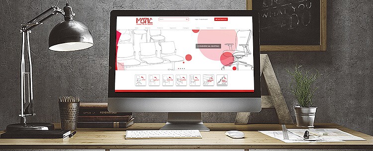
Matic Furniture is a leading furniture manufacturer and importer in Australia, specialising in commercial seating and table solutions.
We designed this online store to reflect the uniqueness and artistic flavour of Matic Furniture’s brand. This layout design evokes a distinctly modern aesthetic with its bold, dramatic, constrained colour palette and smart use of white space.
Crimson brush strokes, circles of deep red and peach, hints of softer grey, and sharp black lines combine here to create a sleek, graphic, “art school” feel. The end result is a creative layout that demands attention and references Matic’s innovative furniture designs.
This layout was also designed to maximise the user experience, with easy, simple navigation. With drop-down menus, every option is only a click away, and browsing is fluid and intuitive.
This is made easier still with an added visual menu at the bottom of the homepage for “Segments”, designed with the same red-spotted, black and white, illustrated motif as the slider to create a sense of visual continuity and additional richness.
2. Australian Chocolate Emporium
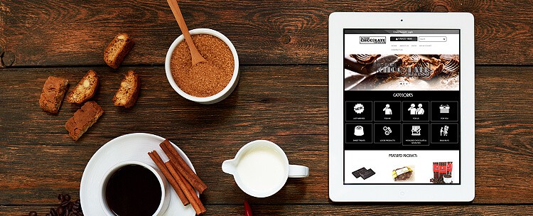
Australian Chocolate Emporium offers a comprehensive selection of premium Australian-made chocolates and confectionery.
To be honest, just contemplating this online store is making us hungry, and isn’t that actually the whole point?
This layout is punchy and effective, and is achieved with a simple monochromatic colour palette that plays off the brown of the mouth-watering chocolate images. This is also carried through with a touch of brown in the logo. Vintage-style typography creates a feeling of old-world service, comfort and elegance, which is further reflected by the logo design.
This layout is just plain delicious, and that’s already half the battle.
3. Makeup Artistry by Lauren
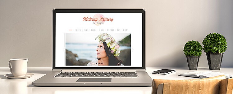
Makeup Artistry by Lauren is a mobile business which offers professional makeup services for special occasions and events, with a specialisation in bridal makeup.
This layout works because it embodies simplicity. It’s clean, crisp and fresh, and is designed to showcase the flawlessness of Lauren’s work.
With a clean white background, simple black text, and warm orange, which brings out the sunset shades in the business’s logo, this bright, simple design is minimalistic but effective, letting Lauren’s beautiful photographs of her work speak for themselves.
The overall effect is one of timeless, simple elegance. Navigation is easy and uncluttered. The architecture of the layout – and overall website – allows for a friendly, intuitive user experience.
For example, the top menu makes page accessibility extremely simple, information is clearly laid out, and important material (such as contact details and information about services) is immediately visible.
4. Blissful Ignorance
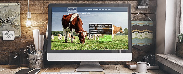
Blissful Ignorance aims to dispel widespread misinformation and ignorance relating to animal cruelty and environmental damage driven by the meat industry.
This layout is powerful, vibrant and visually rich. A full-width slider with a parallax effect allows high-quality, emotionally evocative images to cut through the noise and capture the visitor’s attention. A dark grey and white colour palette, augmented with hints of green, makes for easy reading and focus.
This layout design is impactful and simple, and provides a vital example of how important and effective well-chosen images can be in web design.
5. Skye & Lach
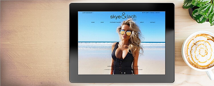
skye & lach sells a range of statement eyewear, hand-picked from selected overseas manufacturers, and inspired by the Australian summer.
This was the second online store we have built for skye & lach, who were extremely pleased with the first. The brief for this one envisioned an editorial, highly photographic feel. We wanted this layout to reflect the brand’s modern, innovative image through simple but bold design, crisp typography, impeccable images, and fine visual detail.
This layout is impossible to ignore: the full-screen slider on the homepage captures the visitor’s attention immediately, effectively showcasing the product and quickly establishing the brand’s summery, beach-oriented style.
This sharp visual detail is also encapsulated in the logo design, which simply but powerfully expresses skye & lach’s hyper-modern brand character. Everything about this layout design is sharp, simple and sleek, and this also applies to the user experience.
6. Daniel Tyrrell Landscapes

Daniel Tyrrell is an award-winning garden and landscape designer based in St Kilda, Melbourne.
This layout was created to reflect Daniel’s clever use of space and high-end landscape design work.
Rounded, slightly offbeat typography, a smart use of white space, and extremely high-quality imagery combine to create feelings of spaciousness and brightness. Charcoal text on a white background is clean and crisp, and the layout is simple, modern and user-friendly.
To further reflect the vibrancy of the brand – and to showcase the services on offer – a carousel with a lightbox effect is used to illustrate Daniel’s landscape work, with each image captioned with information about his services. This is both informative and visually appealing, allowing the visitor to control how much time they spend looking at each element.
7. Logic Energy
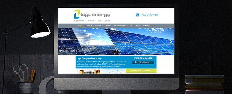
Based on the Sunshine Coast, Logic Energy is a boutique provider of sustainable energy options.
With soothing shades of lime green, grey, and sea blue on a clean white background, this layout is crisp and clean, and evokes feelings of calm, oceanic serenity.
This is also carried over into the vibrant images on the homepage slider, which are saturated with fresh, sparkling blues, greens and greys.
A clear, simple menu makes for unambiguous, straight-forward navigation and a smart user experience.
8. Legoe
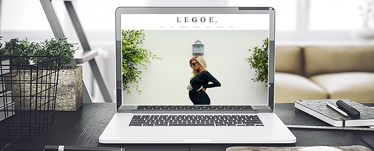
LEGOE. is an Australian lifestyle label providing effortless, high-end basics for modern mums.
This layout is the pinnacle of minimalistic web design. With its dramatic full-screen slider, clever employment of white space and sharp typography, the design for this online store encapsulates everything noteworthy about the product: perfect simplicity; high-end fashion that looks effortless; timeless but completely modern basics.
The spare, monochromatic colour scheme – just blacks, whites and greys – lends this layout feelings of brightness and purity that further heighten the brand’s emphasis on elegant simplicity.
The end result is beautifully uncluttered and fresh, with a seamless menu adding to a streamlined, friendly user experience.
9. AVAD Construction Group
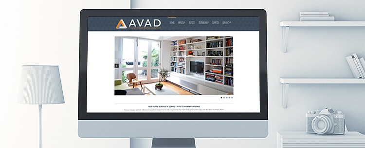
AVAD Construction Group is a leading builder in Sydney, specialising in contemporary architecture, modern design, group homes, renovations and extensions.
This layout was designed for maximum user-friendliness and accessibility. A clean, bright colour scheme of orange, grey and white creates an overall effect of professional simplicity and makes for easy reading.
This sense of understated professionalism is mirrored in the slider on the homepage, with a selection of high-quality images clearly and succinctly encapsulating the construction services on offer, and showcasing craftsmanship and care.
A generous use of white space, neatly organised menu and simple browsing make for a pleasurable user experience. This layout is classical, timeless and subtly effective.
10. Rock Paper Party
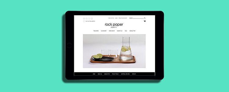
Rock Paper Party sells stylish products for entertaining children, family and friends.
This layout is sweet, simple and stylish. With a monochromatic palette, cute typography, and a vibrant slider, the result is unique, slightly whimsical, and highly effective.
Clean lines in black and white creates a striking, bright effect, and immediately catches the eye of the customer.
11. Daylesford Day Spa & Beauty
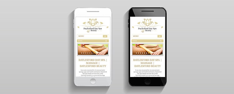
Offering a range of diverse range of therapies, Daylesford Day Spa provides the perfect environment for relaxation, rejuvenation and wellness.
The client wanted their layout to be elegant, refined and classical, and we think this delivers in abundance.
Gold on white with hints of grey speaks of understated luxury and high-end service. This is also carried forward in the logo design, which builds on a delicate, soft floral motif. This aesthetic is subtle, but the message is strong.
Get posting!
If you need some help from a social media specialist, talk to one of our experts today – if you are a current client, call 1300 883 639 – call 1300 796 530 if you are a new client.


