
When a potential Customer lands on your Site, they’re likely to make their mind up about you in a matter of seconds. Although neither you nor the reader may appreciate it, your Site’s basic design is shouting a number of messages. Whether it’s ‘this really isn’t what you were looking for’, or ‘these guys look like they know what they’re talking about’, a first impression is formed in seconds.
Beyond this initial impact, your Site design will also play a big part in deciding whether your reader will stick around to read some of what you’ve got to say, whether they might head over to a few other pages, and which pages they’ll head to if they do. For clarity’s sake, we’re going to do some shouting of our own: your Site design will play a big factor in the success of failure of your new Site.
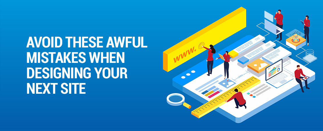
With that said, we’ve asked our team to pull together 3 of their top tips for nailing your Website design.

Keep Your Images High-Quality
Your visuals are a huge part of your Site, but they also give you a big opportunity to get things wrong. Although it sounds like something we’ve stolen from a preposterously priced perfume Ad, perception is reality Online. If I get to your Site and see a couple of grainy, pixelated images, your Site is going to look pretty amateur. And if your Site is all I’ve got to go off, I’m then going to presume that your Business is pretty amateur.
Likewise, keep your images relevant. Wherever possible they should add to my understanding of your Business, products, and services. Again, if your image selection seems to be completely random your Site is going to going to look chaotic. And if your Site is all I’ve got to go off….

Don’t Try To Include Too Much
We’ve seen too many people commit the cardinal sin of trying to cram everything they can think of into their Site. Enthusiasm is great, but it needs to be tempered with a dose of common sense every now and then. If there’s too much going on, you’re going to confuse your reader, and eventually lose them to a competitor.
Similarly, if you’re overloading your Site, the chances of the reader viewing the info you want them to is reduced.

Don’t Forget What You Built Your Site For!
This is another common mistake we see people make time and time again. You built Site to serve a certain purpose. More than likely, you want to either sell directly, or generate leads to be sold at a later time. With that in mind, make sure your design serves YOUR purpose.
Are your best sellers prominently displayed? Is it blindingly obvious to a first time visitor what they need to do to register their interest? The answer to any question of this nature needs to be a big, thumping yes. Begin with your goal in mind, and then design from there.
Whether you’re pulling together your first Site or your tenth, working alone or with a professional, it’s easy to end up with something that you think looks great, but ends up not quite working out. Always keep your goals in mind, and follow the 3 tips above at all times.