An effective and user-friendly Mobile Site is fast becoming an increasingly vital part of any Small Business’s Marketing Strategy. While Mobile Responsive Websites may have once been reserved for the technically talented, Google’s announcement in late 2016 that over half its global searches were made from Mobiles showed that the power of Mobile searching had reached critical levels.
Furthermore, adjustments to Google’s algorithm mean that Mobile-friendly Websites benefit from potential ranking boosts in Google, placing them more firmly in the eyeline of your target customers.
Having a Mobile Responsive Website is now more important than ever for Small Business Owners wanting to appeal to the largest possible audience and keep their Site visitors happy.
By carefully considering the following points, Small Business Owners can ensure they never stray too far from the correct path when negotiating the World of Mobile Responsive Design.

Mobile Sites Versus Responsive Design?
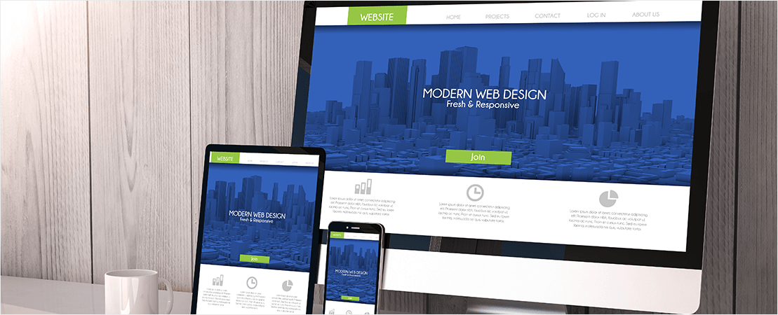
One of the first things to decide upon when considering Mobile Design is whether you opt for a Mobile Site or Responsive Design. While Responsive Design adapts to the way it displays on a range of different devices (e.g. Desktop, Mobile, Tablet), a Mobile Site is an independent Site that’s created in addition to the Desktop version of your Website.
While both have their pros and cons, a dedicated Mobile Site allows you to create an Online experience that is perfect suited to your Online user’s needs and requirements. A Mobile-specific version of your Site enables you and your designers to create a platform unhindered by the concerns of Desktop performance. Additionally, this method is also typically less expensive than Responsive Design, gives you faster load times and contains, simple, straightforward content that’s perfect for a mobile user’s objectives.
It’s important to note however, that when opting for a Mobile Site, you must maintain a consistent Business message across both your Desktop version and the Mobile version. This doesn’t just mean that your content should be very similar (if not the same), but that the design, colours, images, graphics and tone are all true to your Business. An inconsistent message or feel across differing Sites will only lead to confusion and the possible alienation of your visitors.

Space Is At A Premium
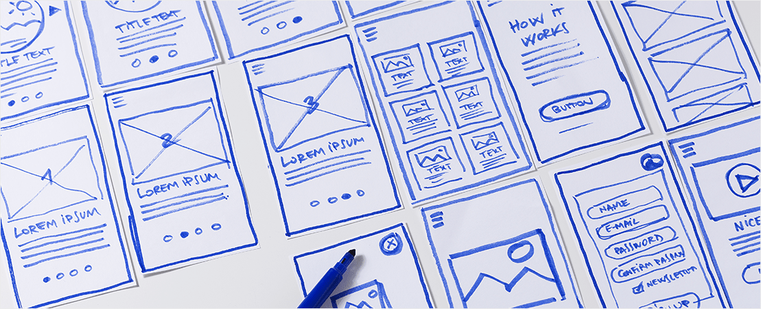
Given that the average screen size has shrunk during the move to Mobile, Graphic Designers are now tasked with the difficult job of producing Sites that convey the same message and ethos in just a fraction of the space. Anything that appears cluttered or difficult to read on Mobile will only serve to turn users off, making it vital that you keep your Mobile content clear, simple and easy to navigate!
One of the simplest ways to free up space when redesigning a webpage is to remove banners and navigation bars. While these serve a legitimate purpose for Desktop browsers, keeping them in Mobile layouts means you’ll be sacrificing a large amount of space.
Although banners do promote brand awareness, on reduced screen sizes they can come at the expense of other content. Navigation is however, an important part of any Website and needs to be simple and easily noticed by users. Many mobile Sites use a menu icon - referred to as a ‘hamburger menu’ - that sits at the top of the screen and serves a simple, yet effective, way for users to easily navigate their way around a Mobile Site.
In this Digital Age the three horizontal dashes of the hamburger menu are as ubiquitous as the roadside stop sign, and users will instantly know where to find navigational options. Stow your menu options away in a hamburger and use this freed space for text and visuals.

Get Your Visuals Right
Images and videos are great tools for engaging your Site visitors, due to their easily consumable and visually appealing nature. They have the ability to break up walls of text and produce an instant wow factor. However, these visuals do come with their own set of unique challenges when it comes to Mobile design.
While the general rule of thumb with banners and navigation bars is to minimize wherever possible, the opposite is generally the case when it comes to images and videos on Mobile Sites. An image that displays at 20% of display width on Desktop is going to be reduced to a miniscule size if displayed at the same dimensions on Mobile. Likewise, a video at the same dimensions is going to become nigh on impossible to operate properly.
In the same way that space-eating banners can deter users, improperly sized images and videos, which can cause excessive load times, will definitely make customers think twice about visiting your Mobile site. Images and animations can have detrimental effects on both the load time of the Site and the user’s battery life, so use them sparingly for best effect.
Most Small Businesses still aren’t giving Mobile the time and attention it deserves. But since 2015, the volume of Mobile searches has boomed, so if you’re still not on the Tablet Train, it’s definitely time to jump aboard! It’s now more important than ever to consider Mobile as an integral part of your marketing efforts and use the above practices to totally maximise your Online Success!


