


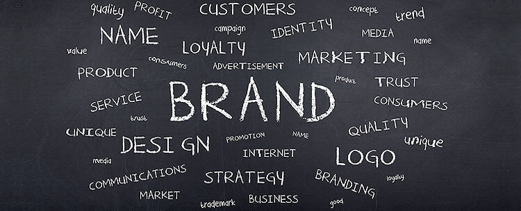
From traditional advertising channels to digital, logos are everywhere, and when you see a good one, you know straight away.
That’s because an effective logo is distinctive, appropriate, practical, graphic, simple, and conveys an intended message.
Sometimes, they also radiate a certain something that you can’t actually quite pin down, but somehow end up branded on your brain.
To create a great logo every time, our designers follow these five basic principles (it also helps that they also have years of experience and a lot of training):
A logo must be simple. Logos must be designed simply. If your message can’t be conveyed with a cursory glance, your logo won’t work. Simplicity allows for easy recognition and makes the logo more versatile and memorable.
A logo must be memorable. The best logos stick in the mind and carry through your branded message. To be effective, your logo should use something unexpected to create memorability (without going over the top).
A logo must be enduring. Your logo is your brand; it needs to carry the message of your business for years. You need to focus on “future proofing” your logo, just as you should your business itself.
A logo must be versatile. Effective logos need to be able to work on multiple digital and print platforms. This leads directly again into the importance of simplicity - creating a complicated logo with moving parts may look fancy or cool, but print media doesn’t have moving parts.
A logo must be appropriate. Appropriate is sometimes a tricky thing to gauge, but what this really just means is that your logo should reflect your business and speak to your target audience.
Here, we look at twenty of Sites n Stores’ uniquely designed logos, exploring what they were trying to achieve and why our designers ended up using the elements they did.
Bespoke Childcare


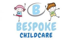
Our client came to us with a rough idea of what they wanted. They had a draft sketch of their concept, so our designers built on top of it, improving the initial design.
To target the childcare market, pastel blues are used to create a sense of calmness, while the dark blue highlights the client’s service. Cartoon children are used to clearly and simply express what the client does, and creates an “Awww” factor.
This is a very simple design which clearly conveys its message to the target audience.
The Party Professionals 2 U
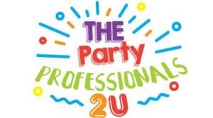
The Party Professionals 2 U is a party supplier and service, catering to kids or super-fun adults.
The client wanted their logo to pop like a party. Our designers used eye-catching colours and abstract shapes to create a party vibe for the brand.
This design focuses on being memorable. The vibrant colours are used to capture the attention of anyone who views it.
Daylesford Day Spa & Beauty

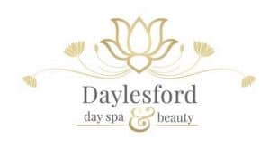
The client wanted to develop a brand that conveyed elegance and high-end service. Our designers decided to use florals as a base for the day spa and gold throughout the brand to create the solution.
This logo is another simple design that uses colour theory to convey a strong message. Gold is perfect for evoking elegance, and here it works fantastically.
Melbourne Academic Centre for Health
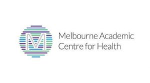
This client does much of their work with other health organisations. The designers focused on conveying this sense of collaboration by employing a range of colours used by the health industry.
This also gives the logo a modern feel, and positions the client as a hub of the health industry.
This design is very subtle and focuses on creating an enduring message for the client. As the Melbourne Academic Centre for Health grows, their logo will be able to remain the same, creating long-term brand awareness.
Prosper & Grow
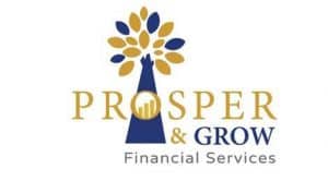
The client needed growth to be the key focus of their logo design. The symbol of the tree and the chart within the “O” are used to express this. Gold is used throughout to suggest wealth; dark blue is employed to create a feeling of professionalism.
Colour theory and subtle symbolism are used here to create a memorable logo for the client.
Smart Study - VCE Revision Lectures
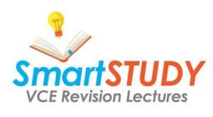
Bright colours are used here to create a connection with bright students. Clear and easy-to-see symbols that are associated with study are used to promote easy recognition of the brand’s core message.
Two contrasting colours make both “Smart” and “Study” stand out, making this logo’s message more memorable.
Papercraft Treasures
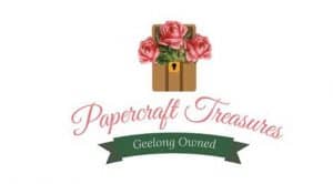
The client wanted their logo to reflect their business focus in the crafting world. Drawing from references provided, our designer created a solution that represented the handmade quality of the business.
Cursive typeface is used to suggest elegance. The word “Treasures” in the business’s name is cleverly extended to a box full of creation.
A light pink colour is used to suggest romanticism, creativity and elegance, and the green creates a feeling of vibrancy and growth. These colours combine to create a simple and versatile logo.
Granny Square Addiction
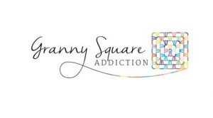
This client had been selling her products on eBay for quite a while, and she wanted to transition to her own website with a new look. She had a clear idea of what she wanted, so after a consultation with one of our designers, a simple logo was created to meet her vision.
The multiple light colours and thatch-work print simply convey the business’s purpose, and the typeface creates an elegant but comfortingly old-fashioned design.
The Tiling House

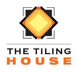
Our client wanted to expand his small business online, as well as rebrand his business with a new look.
He wanted the colour orange and the image of a sun to be incorporated into the logo. The orange is used to create a feeling of new beginnings, while the square/diamond shape evokes imagery relating to both tiles and the sun.
This logo creates a memorable and positive feeling that strongly conveys the client’s vision.
Insight Strategy

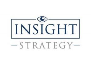
The client requested a professional logo for his business that reflected his years of experience offering business consultation.
Using the eye to symbolise his insight in the industry and to play on the business name, the logo subtly creates a feeling of knowledge and experience. The serif typeface is also used to create a strong professional / traditional look.
This is a very simple and clean logo which conveys its message through a strong typeface.
Slam Bookkeeping

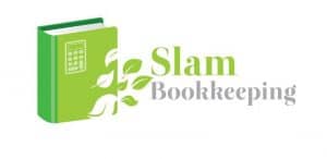
The client wanted a fresh, modern logo to reflect how the efficiency of her services would help clients save time and go through the day without stressing. She specifically requested a peaceful design which incorporated elements that have symbolic links to what her business is about.
The use of leaves blowing in the breeze and different shades of green are used to create a peaceful and vibrant look. The nature of the business is conveyed simply through the use of relevant symbols.
Matrix Manufacturing

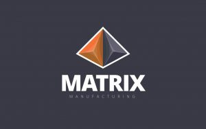
The client asked us to reconstruct and modernise their old logo. This business creates plastic mouldings, so the abstract nature of the logo doesn’t reveal too much about the business, yet it’s a bold and visually intriguing image that quickly catches the eye.
While this logo doesn’t tell the viewer what the business does, it conveys a modern and bold business and is very memorable.
Daybreak Coffee Roasters

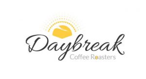
The client requested a design that visually reflected their business name.
The logo was designed to be friendly, welcoming and eye-catching, with strongly contrasting colours to create a sense of intrigue. There’s also a small coffee bean placed within the word “Roasters” to spice up the text and give the logo a unique edge.
The typeface is also used to create meaning. Yellow is used to evoke a warming feeling and suggests at that first morning coffee. This is a very simple design that cuts through with a strong message.
Right Catch Fishing Accessories

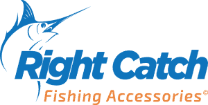
This logo was based on the client’s mock-up. Our designers simplified it to create a cleaner and more minimalistic message.
The more simple direction is used to target a larger demographic - the logo is strong and easy to read. The blue and orange provide a powerful contrast.
This logo again makes use of symbolism and colour theory to create a memorable and simple message for the customer.
World Football Games

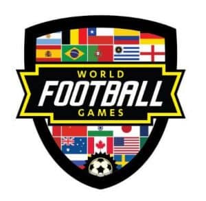
This was a complex design that required a lot of time-consuming attention to detail - the client wanted to fit in a specific list of flags into the shape supplied.
The designers had to do this in a manner that would not compromise the integrity of the logo. The trickiest part was structuring the flags so that that would be aesthetically pleasing – this required a slow trial and error process.
The end result is a logo which functions effectively, conveys a clear and memorable message, and satisfies the client’s brief.
Nerds Network

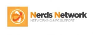
The client is a fan of abstract imagery, and the designers focused on creating a streamlined look for this logo.
Orange is used to suggest a technological bent, and to create a warm, positive feeling. The bold text is clear and easy to absorb. This logo is very simple and the warm oranges attract attention.
Optisight Optical Solutions


This client sells hunting gear with a focus on night vision equipment. The logo was designed to reflect his business through the use of a futuristic crosshair icon, combined with strong text to evoke a powerful, sleek and reliable brand.
The dark text complements the green gradient image nicely, and both elements combine to create a logo with a unique feel.
Country Birdie

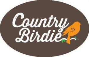
To reflect their shop in the countryside, the client requested a logo with a rugged look and an overall rustic feel.
Browns are highlighted with bright orange and green to keep the logo looking fresh. The simple bird image gives the logo personality, and the stylish font creates a sense of relaxation and country simplicity.
This logo is built around the idea of simplicity and endurance; this will continue to work for the business as it continues to grow.
Dianna-Lee Daniels Psychologist


This logo brings together humanity and nature by fusing an image of a tree with that of a person to symbolise a peaceful, happy mind. The client provides counselling and support for those going through psychologically challenging periods in their lives, so the tone needed to be positive and powerful, adding a touch of abstract elegance.
Positive and cheerful colours are used here to attract attention and carry through the message of a happy mind.
Designs by Adriana

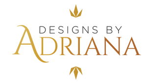
The client asked for a wordmark-focused logo targeting a female demographic.
The slopping text, combined with gold shifting to brown, evokes elegance and maintains the wordmark element.
This logo is simple, clean, and highly adaptable. Its minimalistic message carries through the business’s image and will endure over time.
Get posting!
If you need some help from a social media specialist, talk to one of our experts today – if you are a current client, call 1300 883 639 – call 1300 796 530 if you are a new client.
