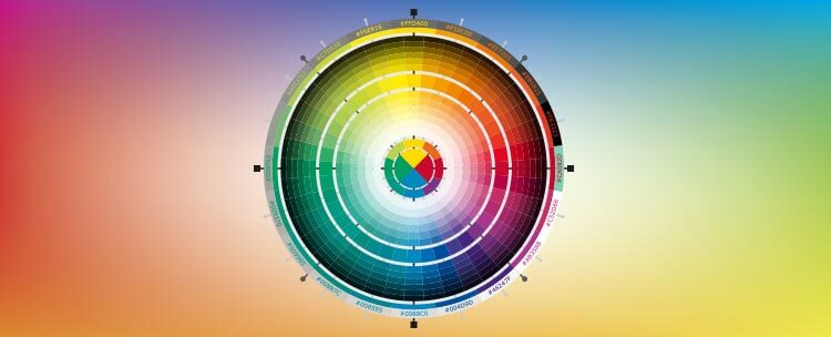
We could write a book on colour theory – and if you go searching, you will certainly find one.
The research behind colour theory goes back to classical art history – master painters have long understood the power of colourisation.
While the art of colour in web design is relatively new, it is underpinned by generations of detailed research. With increased technological advancement, we now have a much greater understanding of the emotions evoked by colour, and exactly how to use them to the greatest effect.
In web design, there are three main types of colour effect/usage that should be considered:
Contrast
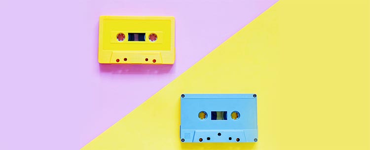
Each colour has its opposite – an analogous colour.
There is no hard and fast rule about using contrasting colours together. They can appear garish and distracting if used poorly, but contrast can also be used to draw attention to a certain point or area.
Complementation
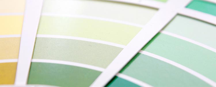
Colours can work together to enhance their effects – this is complementation.
Choosing colours that work together harmoniously is essential to ensure you have a balanced design.
Failing to use complementary colours in web design will lead to terrible conversion rates, with visitors being turned off by your poorly designed (and possibly headache-inducing) website.
Vibrancy
Research shows just how real – and, in some cases, highly physical – our reactions to different colours can be.
Understanding exactly what emotions and physical responses different colours evoke can be a huge boon in web design. An effective web design can use colours to energise or soothe its visitors, and if you create the right emotional pull, the results can be exceptional.
This post looks at twelve common web design colours, and how to use them. We focus on these three aspects of colour theory – contract, complementation and vibrancy – to help you gain a basic understanding of colour effects in web design.
Red
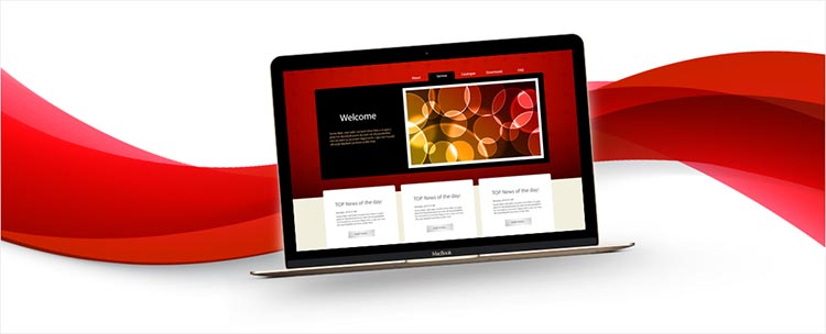
Red is a very “hot” colour. Research shows that it can actually raise blood pressure and respiration rates; it has also been shown to increase metabolism in some people.
While red tends to be associated with anger, it is also connected to feelings of importance and romance (Cupid). Overall, red is positive and categorised as a “warm” colour.
It’s important to note that the colour associations we make have a range of different cultural meanings. In China, red is the colour of prosperity and happiness, and it can be used to attract luck. In South Africa, however, red is the colour of mourning. Globally, it has also become associated with Communism.
Different shades of red can create very different feelings. In design, red can be an overwhelming colour, especially if it is used as a primary colour.
A primary red is loud, in your face, and maybe even a little bombastic. This can be good if you want to attract attention or energise visitors, but if it is over-used, it can ruin a website.
Very dark reds, on the other hand, lend elegance to design. They are subtle and can create a feeling of sophistication and seduction.
Brighter reds create an energetic feel, and are often associated with speed and urgency. Depending on the nature of your business, bright red can be highly effective – consider the effect this would have for a delivery company, for example.
Orange
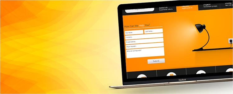
Orange is a secondary colour; it carries many of the same connotations of red, but is considerably softer.
Orange is a very vibrant colour – it is readily associated with fire, and thanks to the fruit of the same name, with life, health and vitality. Orange is also associated with change in general, and can be used effectively to represent a positive move forward. Darker oranges tend to have an earthier tone and are associated with earth and autumn.
Compared to red, orange is considered to be a far friendlier “warm” colour. It is quieter and less aggressive, while still maintaining red’s vibrancy and energy.
In design, orange is often used as a way to draw attention to a particular aspect of a website. In this way, orange can be incredibly useful, offering a pleasing contrasting colour without being too over-the-top.
Orange will rarely be a central focus in web design. To use it as a central colour, you need to choose both the right shade of orange and very strong complementary colours.
Yellow
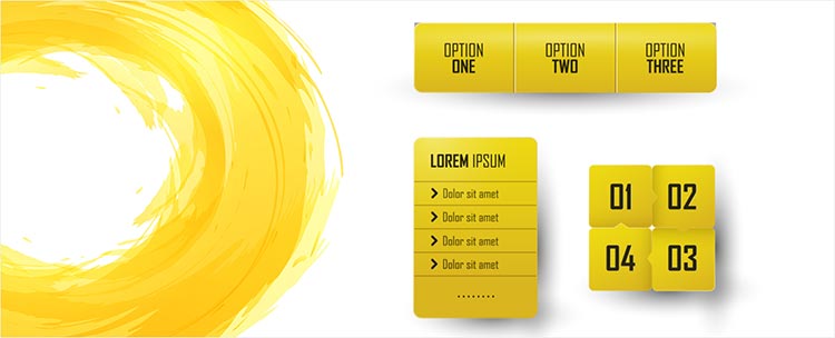
Yellow is often considered the most energising of the “warm” colours. Yellow is a complicated colour with many conflicting, divergent associations. Yellow’s high energy often brings feelings of happiness, hope and sunshine, but it is also associated with deceit and cowardice.
Yellow is a powerful colour, and also has varying cultural connotations. In Egypt, yellow is for mourning. In Japan, yellow represents courage (directly opposed to some of the western connotations). It’s also a colour for merchants in India.
In design, primary yellow lends an energetic feeling of happiness and cheerfulness. It’s a strong action colour, but contrasts poorly with many lighter colours and will fail to stand out compared to colours like red and orange. Light yellows are more calming – light yellow is often used as a gender-neutral colour for websites selling baby and youth clothes. Darker/golden yellows can create a more sophisticated, upmarket feel – they are often used to create a feeling of permanence and importance.
Green
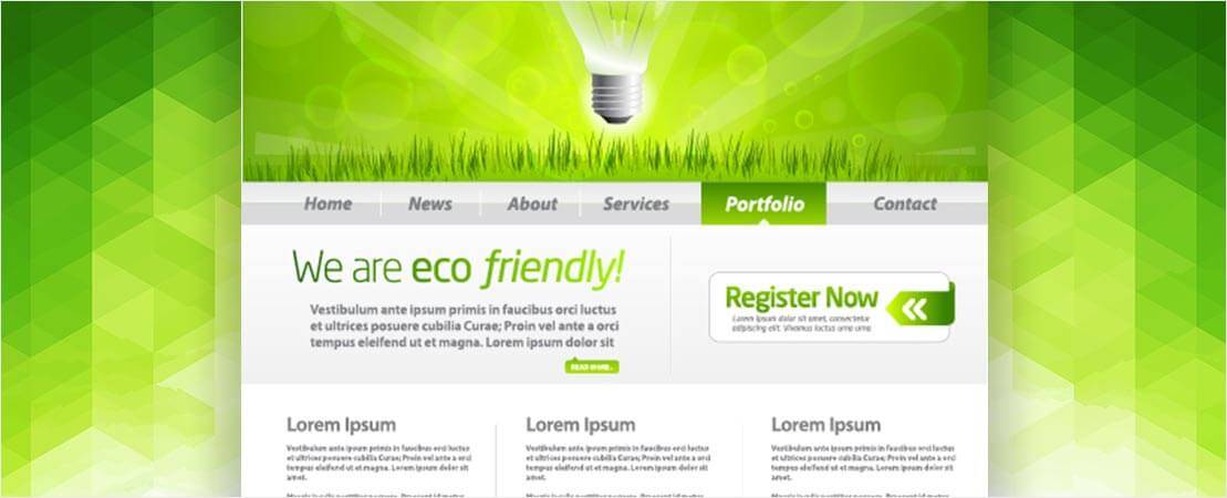
As a cool colour, green is far more subdued than those discussed previously. Cool colours lend a feeling of relaxation, and green is no different. With a range of positive associations including growth, renewal, abundance and wealth, green can be used to evoke a range of calming emotions.
It also has negative connotations, like envy, jealousy and lack of experience. The latter connotation (a “green” person is someone who is not experienced in a particular field or activity) is possibly the most dangerous of these. As a result, new businesses should always use green with care in their web design.
Green is a secondary colour, and combines the calmness of blue with the vibrancy of yellow. In design, this lends green a strong balancing effect – it can be used to harmonise between colours and create very stable, strong websites. Lighter greens are more vibrant and can represent renewal, while primary green is more stable and is frequently used to suggest wealth and abundance. Darker greens are very nature-focused and can highlight growth and conservation.
Blue

Blue is a “cool” primary colour, lacking the vibrancy lent to many of the other cool colours by their secondary colour nature.
Blue is associated with sadness in an English language context, which is something to watch out for in web design. However, blue is associated with calmness, responsibility and reliability. It can also represent peace and spirituality. These associations make blue a very powerful colour in web design.
Like all the colours we’ve covered so far, the meanings evoked by blue are dependent on the shade used. These associations vary a lot, so it is incredibly important to choose the right shade.
Very bright blue carries strong feelings of vitality and youth, and it can be refreshing in web design. However, large amounts of bright blue can often appear garish on a computer screen, so take care when using it. Pale blues are relaxing and often bring to mind the image of a calm ocean. Dark blues are some of the best colours for corporate websites, bringing strong associations of strength, responsibility, stability and reliability.
Purple
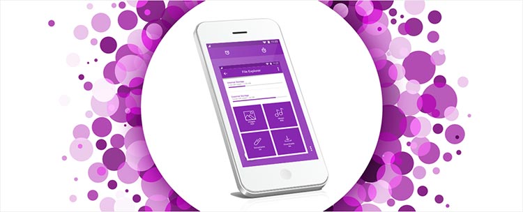
Purple is another secondary colour. As a mixture of red and blue, purple combines some of their attributes.
Purple has long been associated with royalty, thanks to the costly expense of purple dye during the Middle Ages. This association with royalty also extends to connotations of wealth and affluence. Purple is also the colour of creativity and imagination. In Thailand, purple is the mourning colour for widows.
Because the colour is so stronger associated with royalty and wealth, darker purples are often used in web design by expensive tailors and suit brands. Softer purples, like lavender, can be associated with romance and creativity; they will often make appearances on websites where these are important feelings. Multiple shades of purple can also create a fantastically opulent, high-end effect in web design.
Black
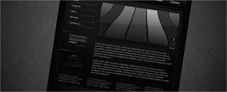
Black is the strongest of all the neutrals, and perhaps the most versatile. Black has the most negative connotations of any colour (as a neutral, however, it’s technically not actually a colour at all).
In the west, it is the standard colour of mourning and is associated with death, evil and the occult. Some cultures also associate it with rebellion. However, black can also create feelings of elegance, power and formality.
Black is the chameleon of web design. The more conflicting associations that can be made with black can be mediated by the surrounding colours and overall design. Black can be used in modern, traditional, conservative or unconventional designs. This makes it one of the diverse web designer’s favourite tools. It is commonly used in edgier and more elegant designs, and can be used to create feelings of sophistication and mystery.
White
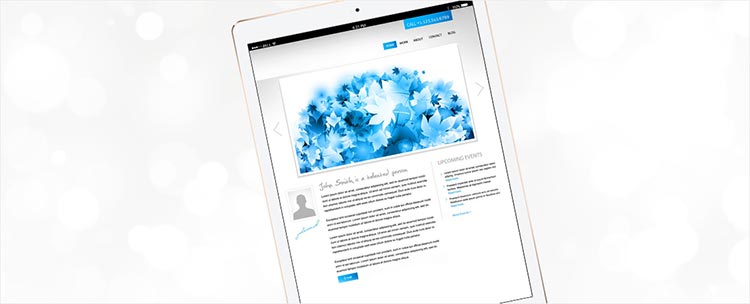
White is black’s opposite (and like black, it’s a neutral – technically not actually a colour), but is similarly versatile in web design. White’s biggest advantage is that when it is used properly, it can work with almost any colour.
White is heavily associated with goodness, cleanliness and purity. It is the traditional colour of bridal attire, and angels are usually portrayed wearing white. White is a colour with a very clear meaning. There are no specific negative connotations to using white, unless you choose the complementary colours poorly.
White can be a very clinical colour, and subsequently makes regular appearances on the websites of dentists, doctors and other health professionals. It can also be used to create fantastic minimalistic designs.
One of white’s greatest abilities in web design is to lend a larger voice to complementary colours. For instance, placing red on a white background will make the red stand out and increase its impact. This is a powerful web design tool, but it can easily cause issues if the wrong complementary colour is chosen.
Grey
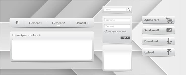
Grey is a very “cool” neutral colour, and is often considered moody and depressing. Grey lacks life and vitality, and is also linked with mourning. It is also heavily associated with formality and professionalism. Grey can connote a lack of humour.
Pure greys are simply shades of black, but it is also possible to create greys with hues of blue and green. These can be used to design interesting looks and complementary colours.
In design, the formality and professionalism associated with grey can work well for highly formal or corporate businesses. Grey is most useful as a stand-in for white (as with softer greys) and black (darker greys verging on charcoal).
Grey is most regularly used for a simple background or typeset to create quiet designs. Grey can also lend a modern and sophisticated feel to a website, especially if a more metallic version is used.
Brown
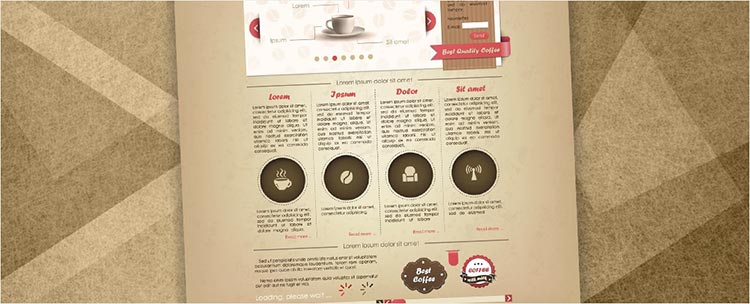
Brown is a natural-looking colour, and is considered to be a warm neutral. Browns are heavily associated with earth, wood and stone. This lends it feelings of dependability, reliability, steadfastness and earthiness. Sometimes, however, brown can be considered to be dull and wholesome – brown will not evoke excitement.
In design, brown can often be found in wood and stone textures. It will often be used as a background colour, but rarely or never in a call to action. Brown can create a warm and wholesome feeling for a website, which can often benefit family-run businesses and some food websites. In its darkest form, brown can be used as a replacement for black in typesets and backgrounds.
Beige and Tan
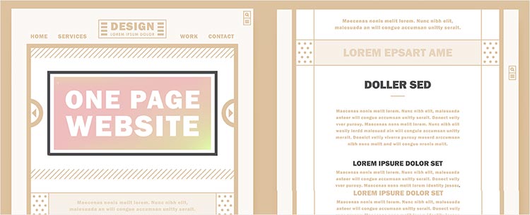
Beige is somewhat unique in terms of the colours we’ve been looking at here, as it can be both cool and warm, depending on the surrounding colours. Beige has the warmth of brown and the coolness of white, so it can theoretically go either way.
Like brown, beige is sometimes considered to be dull. Otherwise, beige has very few inherent associations because it very much conforms to the surrounding colours. It is considered a very conservative colour and is occasionally linked to piety.
In web design, beige’s unique ability to complement other colours means it is most regularly used as a background. It is commonly rendered with a paper texture. Beige has little to no effect on the first impression of your website, thanks to its ability to play off the complementary colours. Beige can be used quite well in a number of designs, but most regularly makes appearances on the websites of conservative businesses.
Cream and Ivory
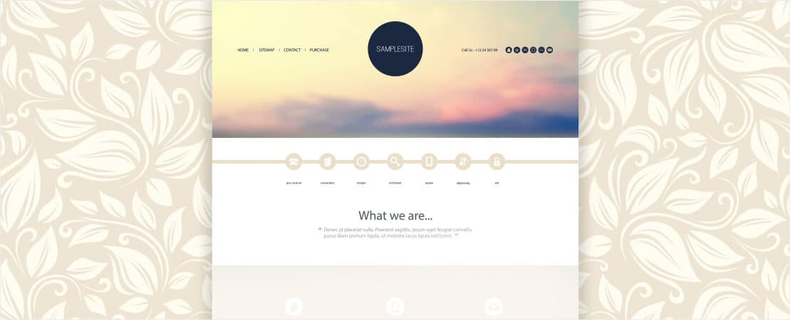
Ivory and cream are sophisticated colours. They are similar to white, but considered to be slightly warmer. This warmer tone is maintained despite the association with purity and elegance. Ivory is quite a calm colour and lends an air of sophistication to the websites on which it is used. It is known to evoke a feeling of history.
Cream and ivory are regularly used as a warmer background alternative to white. They carry many of the same connotations as white, but create less of a harsh contrast with dark colours. If ivory is used with soft, warm, earthy colours like peach and brown, it takes on an earthy tone, too.
Summary
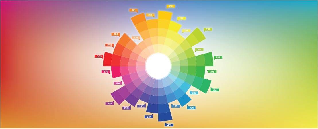
Colour theory isn’t simple – what we’ve looked at here are just some basics relating to some of the most popular colours used in web design. If you want to know more, delve into the web, where you’ll be able to find more in-depth articles used as reference material by web designers.
If we’ve thrown a little too much information your way and you’re feeling overwhelmed, don’t worry – here’s a quick summary that you can use as an easy reference guide.
- Red: Passion. Love. Anger.
- Orange: Energy. Happiness. Vitality.
- Yellow: Happiness. Hope. Deceit.
- Green: New beginnings. Abundance. Nature.
- Blue: Calm. Responsibility. Sadness.
- Purple: Creativity. Royalty. Wealth.
- Black: Mystery. Elegance. Evil.
- Grey: Moody. Conservative. Formal.
- White: Purity. Cleanliness. Virtue.
- Brown: Nature. Wholesomeness. Dependability.
- Tan or Beige: Conservative. Pious. Dull.
- Cream or Ivory: Calm. Elegance. Purity.
Get posting!
If you need some help from a social media specialist, talk to one of our experts today – if you are a current client, call 1300 883 639 – call 1300 796 530 if you are a new client.


