While you probably know the way your website looks is important, you might not realise just how significant its aesthetics really are. It’s so important, in fact, that anywhere from 62-90% of purchasing decisions are influenced by visuals. One of the most effective ways to visually stand out online is through colours, making choosing the right ones absolutely crucial.
When choosing colours for your site, it also pays to remember that behind every colour is a psychological element that can affect and influence your customers state of mind. Colour psychology is closely tied with memories and experiences, which compel people into action .
In order to utilise these psychoanalytics for your businesses benefit, you should first have a good grasp on your audience and the message you want to get across to them. If you get it wrong, you could wind up sending them confusing mixed signals!
So, let’s dive deeper into understanding a few colours and how you can use them to achieve the right message for your business.
Blue
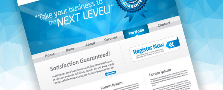
The colour blue is used to cultivate trust in the viewer. It provides an air of coolness and calm, designed to reflect
unity and harmony in what it portrays. Consider how calm you feel when you stare at a soft blue ocean… well, it can have this same calming effect when used on your website.
Blue is often used by businesses that engage in large amounts of money transactions, such as banks and medical centres, as it encourages a sense of trust between the business and its customers.
Yellow
We’ve been uniquely conditioned to see yellow as a warning sign in modern day society. Instead of being the always cheery colours you might think, the colour yellow also serves to warn us of potential danger. Consider ‘wet floor’ signs and poison warnings, which are almost always bold yellow.
On the other end of the spectrum, yellow can be used to invigorate and generate energy, making it suited to highly vibrant and eccentric businesses. For example, if you sell children’s clothing or toys, yellow can be used as a way to promote excitement and a sense of energetic playfulness.
Green
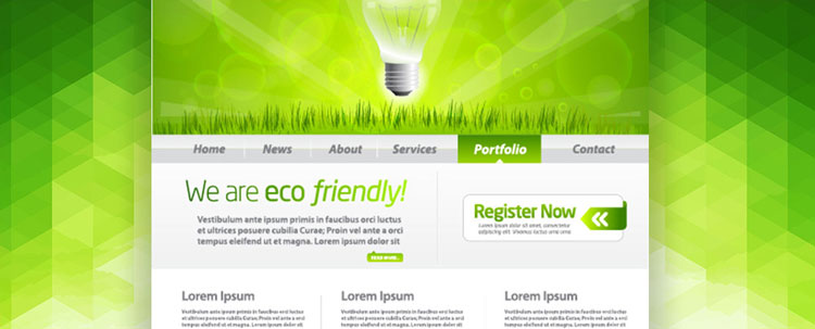
Green is the colour of nature, tranquillity and peace, projecting notions of optimism, rejuvenation and growth. As this is the natural colour of wellness and growth it is a great way to encapsulate these meaning within your website.
This colour is ideally used for websites selling natural, organic products, or those who work outdoors and provide environmental services, such as a gardener or landscaper.
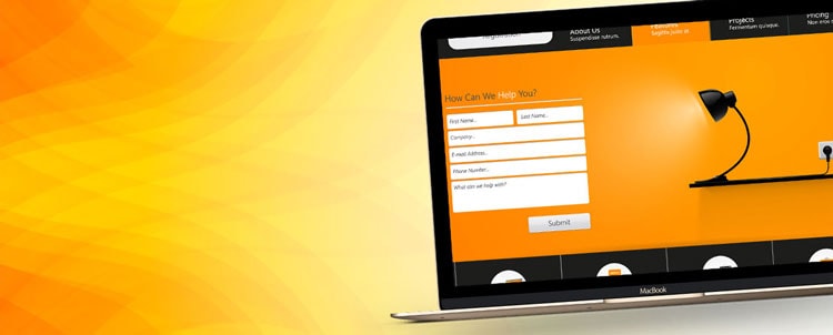
Orange
This is the colour of sophistication. It’s the slightly more mature sibling of red and yellow, being attention grabbing while slightly more modest.
It can also create a unique sense of haste or impulse when viewed, which can make it helpful in subconsciously nudging customers to purchase. It’s also a highly suitable colour to use as a background, as it is invigorating, without being overly loud or outrageous.
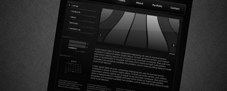
Black
Black is the colour of luxury and value, and can be used in any colour pallet to integrate this feeling. It’s used best when providing contrast to other colours, to help them stand out on your website. Different shades of black, for example charcoal or grey, can be utilised to send varying messages, depending on what you want to say.
If you want to create a completely luxurious, VIP feeling for your customers, then combining black with subtle gold highlights is the way to go!
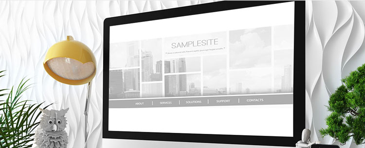
White
White should never be underestimated or left out when considering your website colour design. It might seem laughable, but white is a powerful design feature and, when used properly, can be combined with numerous other colour to emphasise their meaning. So don’t ever discount white, it has much more influence than you think.
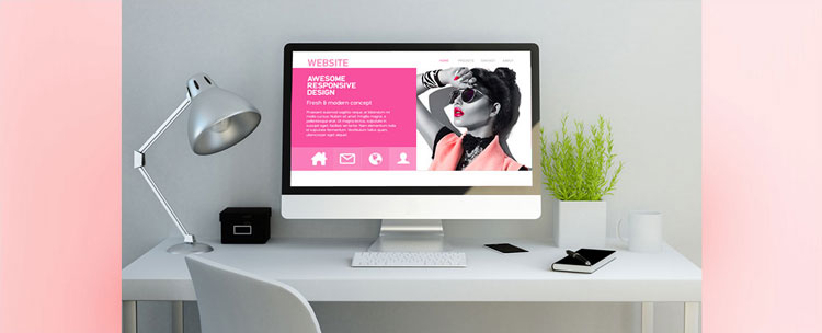
Pink
One of the most powerful colours used in marketing, Pink is the colour of fun and romance. It is a playful colour that brings to mind innocence and emotion, which is a great way to capture the attention of your audience. It is ideal to use when you’re pitching your product to an all-female audience, as the psychology relates back to the fruitful, youthful and fertile elements of life.
This colour can be used as both a background colour or can be highlighted in an image or graphic.
Red
Nothing grabs attention quite like the colour red. It exemplifies notions of passion, energy and vigor. It’s particularly known for projecting ideas of strength, determination and boldness. It can also reflect ideas of comfort, youth and love, making it a true versatile all-rounder.
Though effective, it pays to bare in mind just how bold this colour really is. If subtlety is what you’re aiming for, then red might not be the best choice for your site.
Purple
Purple is the colour of royalty, elegance and sophistication. It projects power and demands attention in an authoritative way.
It is perfect for websites that are selling products or services that are niche yet luxurious, and works even better when partnered with black or gold, as this exudes an even greater sense of style and grandeur.
Gold
This colour signifies power and prestige and works famously well with other colours that signify elegance like green, purple and black.
It is a very visual colour, and brings to mind the element of gold itself, conjuring up notions of value and worth. Using gold throughout your website will position the viewer to see your product as important, though also expensive.
Brown
Brown is a non-descript colour that, not unlike blue, generates feelings of calm. It’s particularly useful when promoting health and wellness, and is often used as a background across all types of websites. Varying shades of brown, from earthy tones to rich chocolate, can be built upon to mean a vast amount of things, making it a hugely versatile colour.
It is the best colour to experiment with and align with other colours to create unique reflections of who you are.
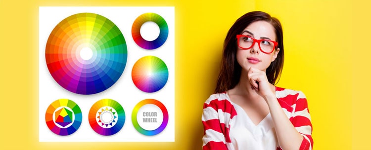
How do I choose my website colours?
One of the best ways to determine which colours will work best to represent your business online is to experiment, while keeping in mind the meanings behind each colour. There are numerous amounts of colours and colour combinations that will hold different connotations and meanings, so see which ones fit best with your products and services.
If you get it right, you could increase your engagement and potentially your sales, just by appealing to people’s subconscious needs and desires.
If the idea of choosing the right colours and design still leaves you baffled and scratching your head, then consider hiring the services of an experienced graphic designer, who is an expert in creating the best aesthetics to suit your business.


